
Website Design Flaws That Stop Local Customers From Enquiring
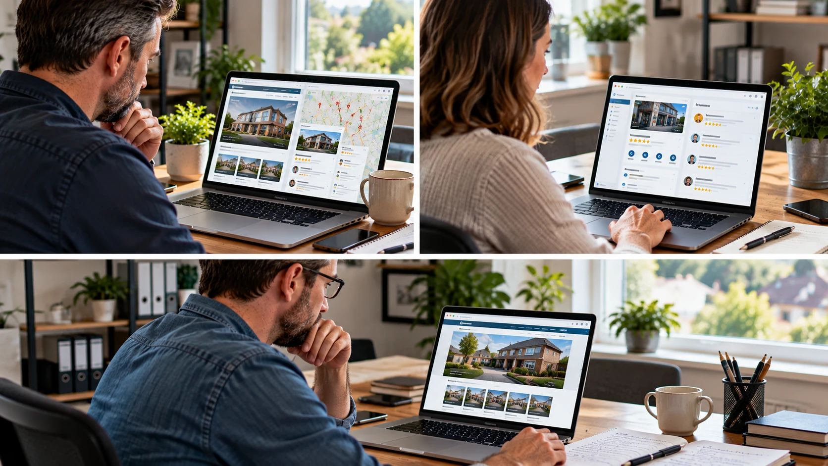
A local business website does not need to be flashy to generate enquiries. In many cases, the best performing websites are clear, easy to use and built around what customers need to do next.
For a business in the Midlands, whether you serve customers in Birmingham, Coventry, Wolverhampton, Leicester, Derby, Nottingham or smaller surrounding towns, your website often has one main job: help the right local person understand what you do, trust you enough to take the next step, and make it simple to contact you.
Design can help that process, but it can also get in the way. A website can look modern and still lose leads if the message is unclear, the contact details are hard to find, or the pages do not answer the questions local customers actually have.
Below are some of the most common website design and content flaws that quietly reduce lead generation, along with practical ways to improve them.
The homepage does not say what you do quickly enough
When someone lands on your homepage, they should not have to work hard to understand your business. Within a few seconds, they should be able to see:
- What service or product you offer
- Who you help
- Where you work or deliver
- What action they can take next
A common problem is a homepage that opens with a vague statement such as “Quality solutions for your needs” or “Helping businesses grow”. Those phrases could apply to almost anything. They may sound polished, but they do not help a potential customer decide whether they are in the right place.
A clearer approach would be more specific. For example, a trades business might lead with the service and area covered. A professional service firm might explain the type of client it supports and the outcome it helps with. Simple wording usually works better than clever wording.
If you want to review this area in more detail, this guide on what a local business homepage should include is a useful starting point.
The website looks good but does not guide the visitor
Many business owners focus on how a website looks, which is understandable. First impressions matter. But design should not only be about colours, images and layouts. It should guide the visitor towards a useful decision.
Good website structure helps people move through the page naturally. The visitor should be able to scan the page and understand the journey without needing to think too much. A strong local business page often follows a simple pattern:
- Confirm what the service is
- Explain who it is for
- Show why the business can be trusted
- Answer common questions
- Make the next step clear
If a page jumps from a welcome message to a gallery, then to a long block of text, then to a contact form with no clear explanation, people may lose interest. Visitors are not always patient, especially on mobile. They may be comparing several local businesses at the same time.
Think of each important page as a conversation. What would a customer ask first? What would they need reassurance about? What would help them feel ready to call, email or request a quote?
Calls to action are too weak or too hidden
A call to action is simply the next step you want someone to take. It does not need to be pushy. In fact, for many UK local businesses, a calm and direct call to action works best.
Examples include:
- Call to discuss your project
- Request a quote
- Book a consultation
- Send us your enquiry
- Ask a question
The problem is that many websites hide these actions. The phone number may only appear in the footer. The contact button may blend into the menu. The form may be long, awkward or only available on one page.
Every key service page should make it easy to enquire. That does not mean placing a bright button after every sentence. It means making the next step visible at sensible points, especially after you have explained the service, shown trust signals and answered common concerns.
The website copy is written for the business, not the customer
Another lead generation issue is copy that talks too much about the business and not enough about the customer’s situation. It is natural to want to explain your experience, values and background. Those things matter. But visitors are usually asking themselves more practical questions.
They may be thinking:
- Can this business help with my specific problem?
- Do they work in my area?
- Are they suitable for a small business, homeowner or larger organisation?
- What happens if I contact them?
- Can I trust them?
Your website should answer those questions in plain English. This is also helpful for Google and AI search systems because clear content makes it easier to understand what your business offers and who it serves.
There is a balance to get right. Your website should not be stuffed with keywords or written only for search engines. It should be useful for real people first, while still being clear enough for search systems to interpret. This article on whether your website is written for customers or search engines explains that balance in more detail.
Trust signals are missing or poorly placed
Local customers need reassurance before they get in touch. They may be inviting someone to their home, choosing a supplier for their business, or spending money on a service they do not fully understand. Trust matters.
Useful trust signals can include:
- Genuine customer reviews
- Photos of completed work where appropriate
- Accreditations, memberships or qualifications
- Clear business contact details
- Case studies or examples of work
- Information about your process
- Answers to common questions
The placement of these trust signals is important. If reviews, qualifications or examples are buried on a separate page, visitors may never see them. Place relevant reassurance close to the point where someone is deciding whether to enquire.
For example, a service page can include a short review related to that service, a few photos, and a brief note about how your quote or consultation process works. This helps reduce doubt without making the page feel overloaded.
Mobile visitors are treated as an afterthought
A large share of local searches happen on mobile devices. Someone may be looking for a plumber during a leak, a solicitor during a stressful situation, a restaurant while out shopping, or a supplier between meetings. If your website is awkward on a phone, you can lose good enquiries quickly.
Common mobile problems include:
- Text that is too small
- Buttons that are hard to tap
- Menus that are confusing
- Images that push important content too far down
- Forms that are difficult to complete
- Phone numbers that cannot be tapped
A simple mobile check is to open your website on your own phone and try to act like a first-time visitor. Can you understand the business quickly? Can you find the main services? Can you contact the business without frustration? If not, the design may be costing enquiries.
Pages create friction instead of confidence
Lead generation often fails because the website creates small moments of doubt. None of these issues may seem serious on their own, but together they can make a visitor leave.
Examples of friction include:
- No clear location or service area
- Out-of-date content
- Broken links or missing images
- Slow-loading pages
- Long forms asking for too much information
- No explanation of what happens after an enquiry
- Generic stock images that do not reflect the business
For local businesses, clarity around location and service area is especially important. A person in the West Midlands, East Midlands or nearby towns wants to know whether you can help them. If that is not clear, they may choose a competitor who makes it obvious.
If you are seeing traffic but few enquiries, it may be worth reviewing why website visitors leave without contacting a business. Often, the issue is not one dramatic mistake, but a group of smaller barriers.
This article is based on the ideas discussed in the embedded video, with added UK local business context and practical guidance for business owners.
Your service pages are too thin
Some local business websites rely heavily on the homepage and have very little detail on individual services. This can limit both conversions and search visibility.
A strong service page should do more than list the service name. It should explain what the service involves, who it is suitable for, the types of problems it solves, and what the customer can expect when they make an enquiry.
For example, if you offer several services, each main service should usually have its own clear page. This helps visitors find the information most relevant to them. It also helps Google understand your website more accurately.
Thin service pages can feel unfinished. If a visitor lands directly on one from Google, they may not have enough information to take action. Adding practical detail, helpful headings and relevant trust signals can make a real difference.
The website does not explain the next step
People are more likely to enquire when they know what will happen next. If your website simply says “Contact us”, some visitors may hesitate. They may wonder whether they will be pressured, how long it will take to hear back, or what information they need to provide.
You can reduce that hesitation by setting expectations. For example:
- Tell visitors whether you offer a free initial chat
- Explain what details are useful in an enquiry
- Say whether you respond by phone or email
- Outline the basic process from enquiry to quote or appointment
This does not need to be long. A short section near the contact form can make the process feel more comfortable and straightforward.
A practical checklist for improving lead generation
If you want to review your website, start with the pages that matter most: the homepage, main service pages and contact page. Look at them from the visitor’s point of view, not just as the business owner.
Use this simple checklist:
- Can a new visitor understand what you do within a few seconds?
- Is your location or service area clear?
- Are your main services easy to find?
- Does each service page answer practical customer questions?
- Are contact options visible on mobile and desktop?
- Do buttons and links clearly explain the next step?
- Are reviews, examples or credentials easy to see?
- Is the contact form short and easy to use?
- Does the page load quickly enough?
- Is the wording clear, natural and helpful?
You do not need to fix everything at once. Start with the issues that most affect enquiries. Often, clearer wording, better page structure and more visible contact options can improve the website without a full rebuild.
Make your website easier to choose
Good website design is not just about appearance. It is about helping the right customer feel confident enough to act. For a Midlands local business, that usually means being clear about what you do, where you work, why people can trust you, and how they can take the next step.
If your website is getting visits but not enough enquiries, the issue may not be traffic alone. The website may need clearer structure, stronger content and a smoother path to contact.
If you would like a practical review of your website structure and content, you can contact BE Marketing and SEO Midlands or start a chat. We can help you identify the areas that are holding back enquiries and suggest sensible improvements.